Microsoft has launched, in preview mode, their most innovative tool till now, for creating Professional Dashboards and Data visualizations. This tool is called Microsoft Power BI. The BI acronym states for Business Intelligence.
Originally created as a complementary set of tools for Excel, the concept evolved into a Power toolkit aimed not only to Business Intelligence Analysis but also for Big Data Analysis and Data Science.
Power BI was created with Microsoft’s Strategy “Mobile first, Cloud first” in mind and is part of the Office 365 productivity suite. The tool is incredibly simple, incredible powerful and the interface usability is great for browser based tablets to notebooks.
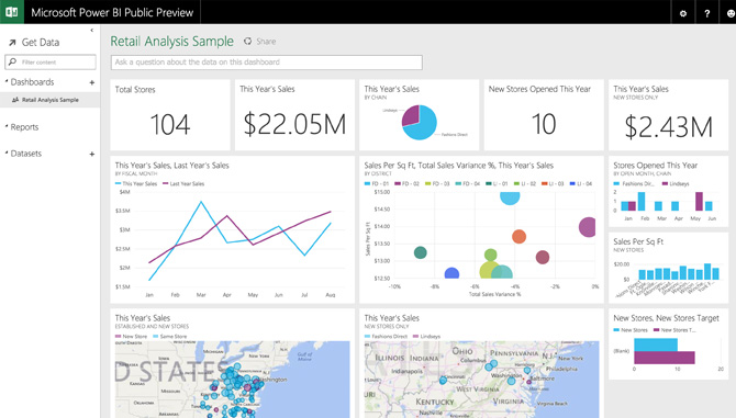
For this post we have created an example just to showcase how simple and powerful this tool is right now and how it might become a game changer in the near future.
Where To Start ?
Any Dashboard starts with defining the datasets, that means, which is the information to analyze and present in a summarized view. Power BI makes it extremely easy to create datasets providing several data sources and visualization widgets. At preview mode, there are ten (10) pre-built data sources. For sure, this data sources will match most users needs, but Microsoft also provides the ability to create your own data source through REST API’s interaction with the Power BI Engine. This means users will be able to extract data from any data source their organization provides.
Data Source
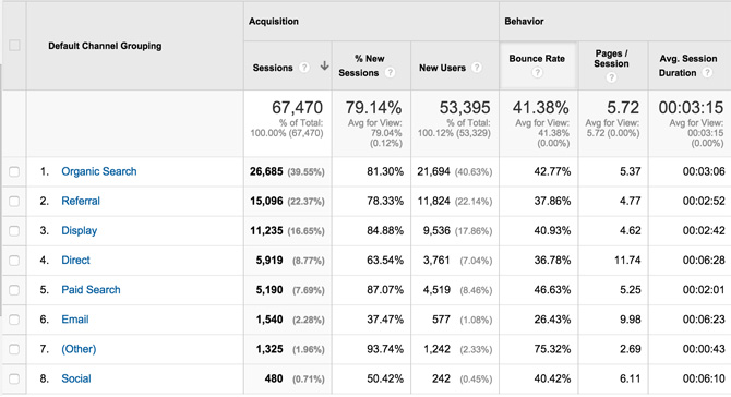
In order to analyze the power of the tool, we decided that our example will be based on real data we use in our daily analysis.
- For that we extracted Google Analytics Data from our site and exported it to Excel through a CSV file.
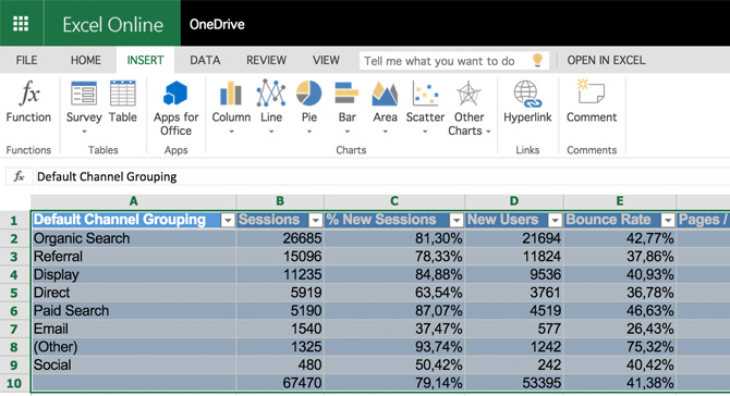
- We uploaded this CSV file into our One Drive account, to make it easily available for Power BI. Power BI Excel data sources are absorbed automatically from Excel Tables, so in order to take advantage of this semi automatic process, we just edited our Excel File from One Drive, using Excel Online Web App, and created one table for each table Google Analytics exported from our Traffic Channels Data.
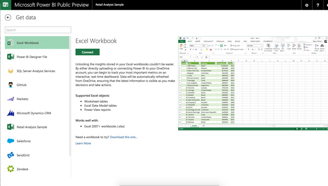
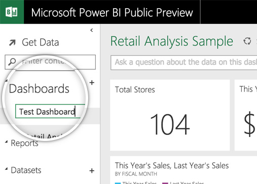
- The next step takes place at the Power BI interface. Users create a New Dashboard where the data will be imported and the Dashboard created. The interface is simple, go to the Dashboards section at the left pane, and press the plus (+) symbol. Name the dashboard and the interface will navigate to the importing options.
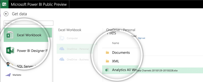
- The interface navigates to the Get Data menu; we selected the Excel Workbook Data Source from the left pane, then selected the One Drive – Personal File source, and finally selected our workbook from the online folder that appeared.
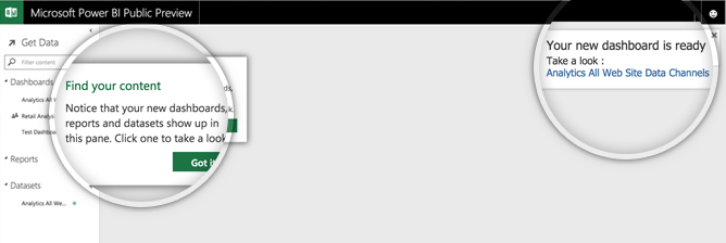
- Once the Dashboard is created, and the Data Imported, Power BI Publishes the new data source to be used in the dashboard widgets tool.
Dashboard Canvas
Reaching the step when the Data Source is ready, the user can create its dashboard through different reports. Each report will have different data visualizations which the user will be able to pin in the main dashboard. Lets move forward with the example.
Creating Reports
Power BI Reporting Tools is extremely powerful but simple. It resembles the interface of Pivot Tables from Excel, making it intuitive for the regular Office user. In the left side of the Report creation tool, Power BI presents each Report Page (it uses the page navigation interface that resembles Microsoft Word and PowerPoint tools). In the right side Power BI presents a Data Source navigation pane. Following our example, we can see the column names of the Tables imported. Each column of the table can be selected with a checkbox and then selected the way the data will be visualized. This will create a metric Widget. For creating metrics for the report the users can follow the next steps:
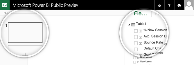
- The user selects the data points that would like to visualize. As shown in the image, users can select numerical values and series values. Series values are ideal for labeling data.
- After the user selects the data points, a widget will appear over the report canvas, having the data points as its dimensions. This is the main reporting widget tool. As the whole tool, it has the objective to be extremely easy to use. The user can select the data visualization desired for the widget just clicking on the chart button.
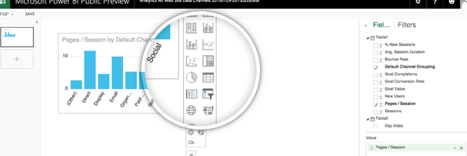
The available data visualization contain the well known Excel charting options and great Business Intelligence visualizations that Power BI adds.- Horizontal Bar Charts
- Stacked Bar Charts
- Vertical Column Charts
- Stacked Column Charts
- Bar and Column Charts with Trend Line
- Line Charts
- Area Charts
- Table (normal and pivot)
- Color Map Chart
- World Map Chart
- Country Map Chart
- Gauges
- Scatter Plots
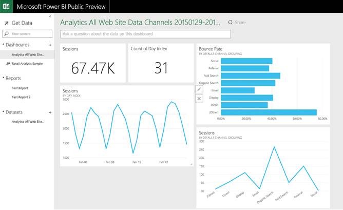
- In this example we select the line chart and the Default Channel Grouping labels. The user can resize the chart or add more charts to the report. Also, in the left side panel, the user can create new report pages with more metrics. Each Metrics has a Pin Icon that which functionality is to place the metric in the main Dashboard.
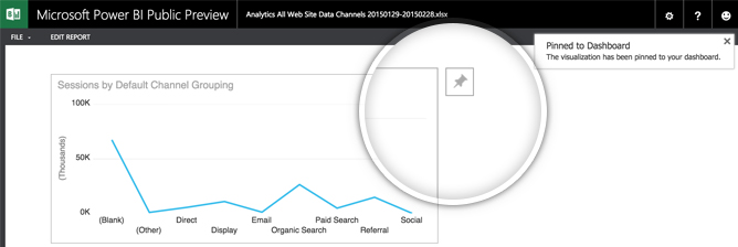
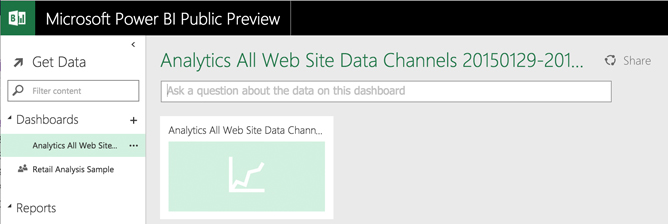
- Finally the user saves the Report and returns to the Dashboard, where the new Pinned widget will appear.
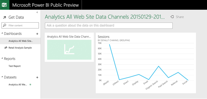
Building the Dashboard
For the example, we repeat steps 1 to 4, creating the remaining report metrics we want to add to our Dashboard and Pinning them into the main canvas.
Updating Information
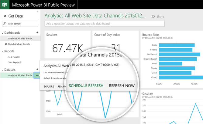
The data source used for the example was statically extracted from another tool (in this case Google Analytics). For a Dashboard to be useful, it should reflect new data regularly. Users can automate the importing procedure with external tools, that save new data into the One Drive Workbook. If this is achieved, this means fresh data will be populating the Excel Workbook regularly. In order to refresh the dashboard accordingly, users have two (2) options:
- Refresh Now: Just navigate to the dashboard options at the left pane and select Refresh Now. In one click Power BI will read the excel workbook and update the metrics data points. With this procedure your dashboard will be automatically updated to the most recent data imported in the Data Source. This refresh option is popular for Data Sources that provide new data in real time (or near real time).
- Schedule Refresh: This functionality is really useful when the process of importing data is part of a workflow, that has scheduled temporal steps. This means that does not query data in real time. In our example, if the importing procedure from Analytics to One Drive was already automated, and we schedule it to run every night, then we can schedule Power BI to refresh the dashboard every morning, and when accessing to the dashboard, the data will be from the previous night import.
Conclusions
Power BI is a simple and powerful data analysis tool, built with a responsive user interface that resembles the new Microsoft Office products. It integrates naturally with Microsoft Data products as Excel, SQL Server and Dynamics. It provide the ability to create new data sources from a REST API. The dashboards visualizations contains the traditional Office charting solutions and professional complex visualizations (like maps and scatters) that come from the data science space.
Power BI is an ideal tool for any business that wants to create professional business dashboard integrating different and heterogeneous data sources, and see the calculated metrics in a centralized and friendly Dashboard.
This was our introductory post for Power BI. We will publish more in the near future drilling down in the features that are available.